Kultursommer
Identity / Photo / Specialty / Web
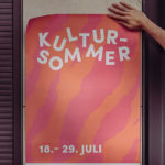
New visual identity for long-established city festival.
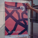
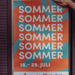
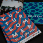
In the 40th year of the event the renewal of the appearance was entrusted to us. We designed 6 different summery patterns and color combinations, half of which relate abstractly to the city (for example Oldenburg map parts) and the other to the summer.
On the streets.
For each of the eye-catching patterns, a poster was designed that draws the public’s attention to the festival in large letters. Banners were stretched between houses throughout the city.

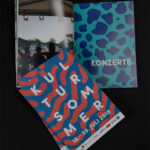
To coincide with the anniversary, for the first time there was a published book, that we were asked to design.
On desktops. On mobile devices.
Over 5,000 visitors a day quickly find the information that is relevant to them, but they are also invited to browse the site. Illustrations and animations complete the individual festival page.


